Projects
The Berkeley & Quincy Lofts
UPSCALE SISTER APARTMENT COMPLEXES, THE BERKELEY AT WAYPOINTE AND QUINCY LOFTS, located IN NORWALK , ct.
WEBSITE
STATIONERY
SELL SHEET
https://www.behance.net/gallery/158384545/The-Berkeley-Quincy-Lofts


The Posters
A collection of posters.
https://www.behance.net/gallery/136854393/kollekcija-posterov

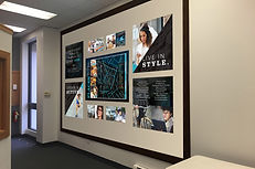
West of Chestnut
luxury apartment community in Quincy, ma with a modern aesthetic and bold look.
wall display
interior signage
stationery
sell sheet


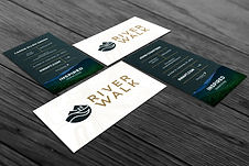
River Walk
rebrand of a student living community in the natural setting of cullowhee, nc, right off the Tuckasegee River.
Sell sheet
business card
bus wrap
digital mood board


HCADV
Hospitality coalition against domestic violence, or hcadv, is a collection of hospitality professionals who collaborate with women's shelters and seek to create a safe space for women. Using safe words unique to each establishment, hcadv helps women escape domestic violence or other potentially dangerous encounters.


Drawing with a pen
My marker graphics in a sketch.
https://www.behance.net/gallery/157459497/Drawing-with-a-pen


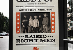
Dave and Busters
SPECIFIC RECURRING EVENT NIGHT BRANDING FOR "FEEL GOOD FRIDAYS" AND "THE GIDDY UP" AT DAVE AND BUSTERS IN DALLAS, TEXAS.
Feel good Fridays branding reflects the high energy and fun of the acoustic music nights THROUGH BRIGHT DUOTONES AND FUNKY PATTERNS, while the giddy up models its branding after vintage wanted posters to harken back to the wild west aesthetic FOR THE COUNTRY MUSIC NIGHTS.
printed posters
digital posters
social media stories


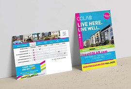
COLAB Student Living
A hip and modern new student living community in Denver, CO with bright and bold branding.
Direct mailer
Business card
Digital parents guide
https://www.behance.net/gallery/158376107/COLAB-Student-Living


Fox meets owl
Branding for the business coaching network "Fox Meets Owl" combined the images of an animal and a bird, so the brand idea and identity design seek to refute the established cliches in the coaching business.
The combination of a fox and an owl in the name of the company was an attempt to abandon the established cliches in the field of business coaching. In the design of the logo, the fox is an aspect of cunning, intelligence, energy, and the owl personifies wisdom and an extensive 360-degree view.
The logo combined both animals, creating an indissoluble image in which a fox would not be read without an owl, including by playing with a buttress. First, the image of a fox is visually read, and only then the viewer sees a flying owl, which was done intentionally.
When the owl "manifests" between the fox's features, there comes a "moment of identification", which reflects the main idea of the company "to bring a new perspective and shed light on elements that were not visible, but may have already existed."
The color palette is inspired by the fox coloring. The orange color is made very bright so that it works better in the digital space.
Face37's Bobby font was used in the identity, which at first glance seems a bit bookish, but at the same time has softness and quirkiness. The fox is a more playful animal, and the owl is more serious, and this was reflected through the chosen font.

Escondido
BRINGING AUTHENTIC TEX-MEX BACK TO DALLAS AT PRESTON AND ROYAL. escondido's WHOLE BRANDING CONCEPT IS BASED ON MEXICAN OTOMI embroidery ARTWORK, which brings the brand to life with bright colors, animals, and foliage.
logo creation
10 unique otomi illustrations
menu design
gift cards & investor cards
window graphics
print collateral: coasters, flyers, signage, napkins, shirts


